
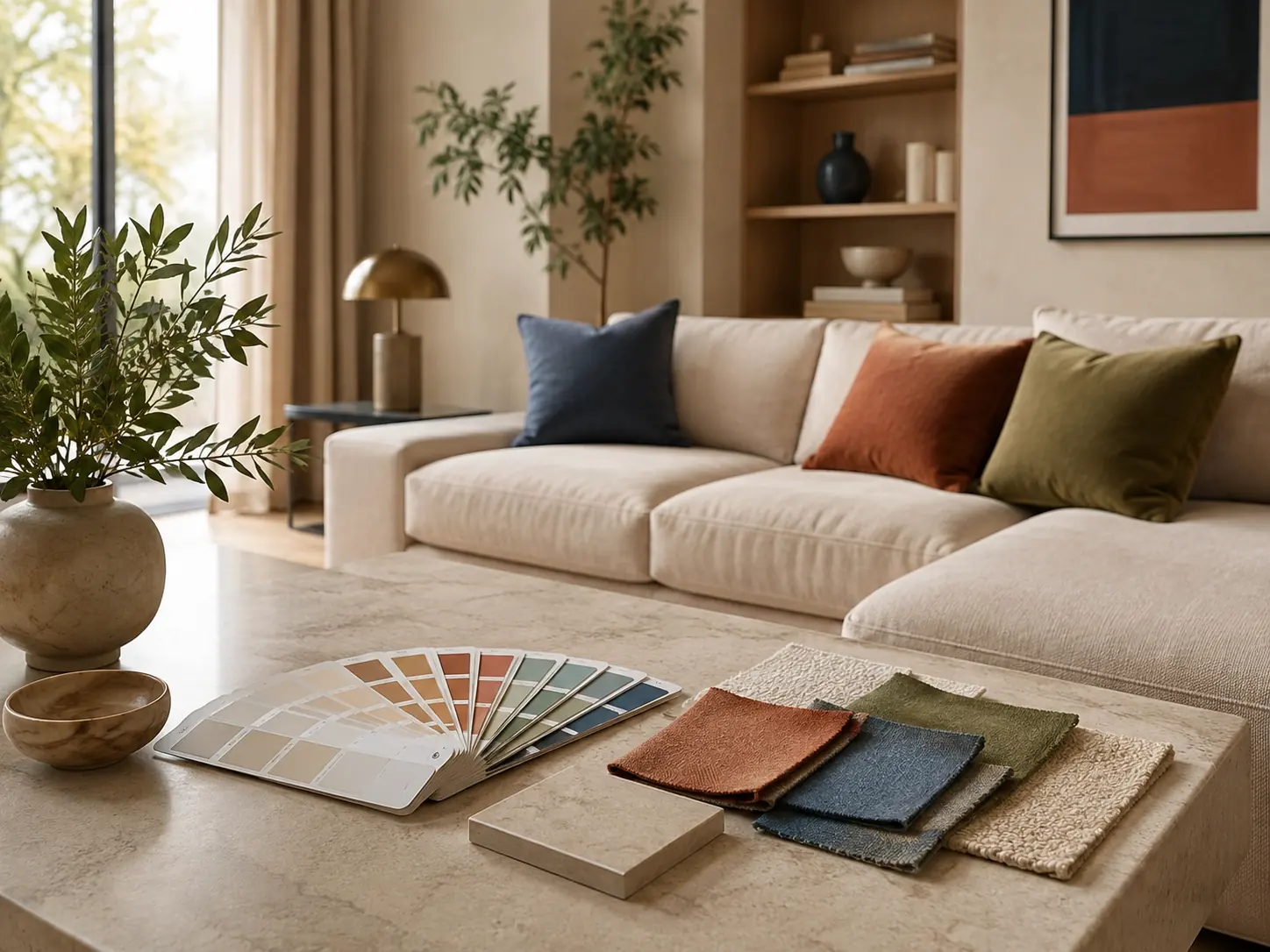
A colour on a small sample under shop lighting rarely looks the same across a large wall. Its appearance is influenced by the room’s orientation, flooring, wood, curtains, neighbouring walls and artificial light. That is why a palette should be chosen as a relationship between surfaces in a particular space, not simply as a collection of attractive swatches.
A good palette does not have to be neutral, but it needs a clear hierarchy. When every element asks for attention, the room can feel unsettled even if each colour is appealing on its own.
Start with the elements that are hardest to change
Flooring, stone, joinery, kitchen fronts and larger pieces of furniture generally last longer than wall paint. Their shades and undertones should be the starting point. If a floor has a warm, slightly red undertone, a cool grey wall may emphasise it rather than soften it.
Prepare a small material board: a floor sample, wood, stone, sofa fabric and two or three possible wall colours. Look at them together in the room where they will be used.
Daylight changes how colour is perceived
In Montenegro, north-facing rooms generally receive cooler, more even light, while south-facing rooms experience stronger changes through the day. An east-facing room is brighter in the morning; a west-facing one receives stronger evening light. Nearby buildings, planting and overhangs further affect the result.
The same white can therefore appear creamy in one room and grey or slightly blue in another. A shade name is not a reliable guide on its own: test the paint in the actual space.
Base, secondary and accent tones
It helps to think in three layers. The base tone covers the largest surfaces and connects rooms. A secondary tone appears on the kitchen, a substantial piece of furniture, curtains or a rug. The accent occupies the smallest area and may be a deeper colour, metal, artwork or distinctive stone.
The familiar 60–30–10 rule can be a starting point, but it is not a mathematical formula. In a monochromatic interior, textures may provide the contrast instead of three separate colours. In a home with an art collection, quieter walls can give the works room to stand out.
Undertone matters more than the colour name
Beige shades can carry yellow, pink, green or grey undertones. If an undertone conflicts with wood or stone, a room may feel wrong even when the reason is not immediately obvious. Compare samples against the actual materials rather than against plain white paper.
With white walls, also consider doors, window frames and ceilings. If several whites are used, their difference should be intentional. Very similar but mismatched shades can look like an error.
Test paint under real conditions
Paint a larger sample area or a movable board that can be placed around the room. Look at it in the morning, on a cloudy day and in the evening with the lighting you intend to use. A small swatch placed beside another strong colour can give a misleading impression.
Check the finish as well. Matt paint appears softer and is more forgiving of minor surface imperfections, while greater sheen reflects more light and makes the substrate more noticeable. In kitchens and bathrooms, cleaning and moisture resistance must be considered alongside appearance.
Connect rooms without repeating the same formula
An open-plan living area benefits from continuity, while a hallway, bedroom or study can have a different intensity. Repeating a wood, metal or colour across several rooms creates a connection even when the wall colours are not identical.
Judge transitions from the doorway. Stand where two or three rooms can be seen together and consider whether their colours support each other or compete for attention.
Three palettes that work with natural materials
Sand, light oak and olive green
A calm, light combination that suits apartments with generous daylight. Green can be limited to textiles, a chair or one defined element.
Warm white, walnut and smoky stone
A more contrasting palette for an elegant interior. The stone and grey tones should have enough warmth to remain connected to the walnut.
Limestone tones, terracotta and dark metal
A connection with Mediterranean materials without copying a rustic style literally. Terracotta works particularly well when used sparingly and repeated in a few details.
Common mistakes
- Choosing wall paint before flooring, kitchen finishes and larger furniture.
- Deciding from a photograph taken in different light or edited afterwards.
- Combining too many whites and beiges without checking their undertones.
- Using equal amounts of every colour, with no dominant base.
- Overlooking evening lighting and the colour temperature of the light source.
- Buying all decorative items at once.
A palette is one part of a coordinated design. To connect it with layout, materials, lighting and furniture, explore our interior design service or send information through our project enquiry form.